
Color psychology in kit design influences how players feel and how fans connect with your team. Bright reds boost confidence and passion, making the team look energetic, while calming blues help focus and trust. Different cultures interpret colors uniquely, so understanding these symbols can strengthen your global appeal. Effective use of color builds brand recognition, loyalty, and emotional ties. Explore more to discover how innovative color choices shape sports culture and fan engagement.
Key Takeaways
- Colors evoke specific emotions and associations, influencing player confidence, focus, and fan engagement.
- Strategic color choices enhance brand recognition, convey team values, and foster emotional connections with supporters.
- Understanding cultural color symbolism helps design kits that resonate locally and avoid misinterpretation.
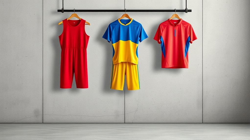
- Bold colors like red symbolize passion and energy, boosting team presence and fan excitement.
- Innovative color applications and materials can create visual impact, differentiation, and strengthen overall team identity.
The Psychological Impact of Color Choices in Sports Kits
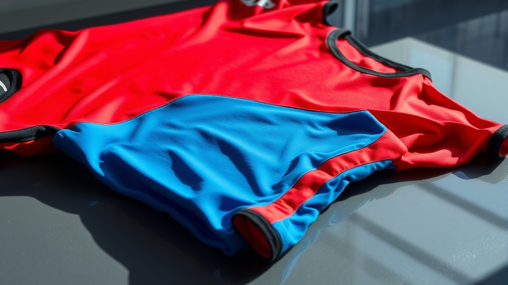
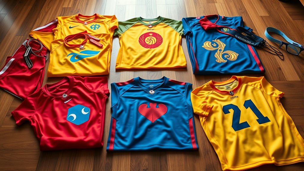
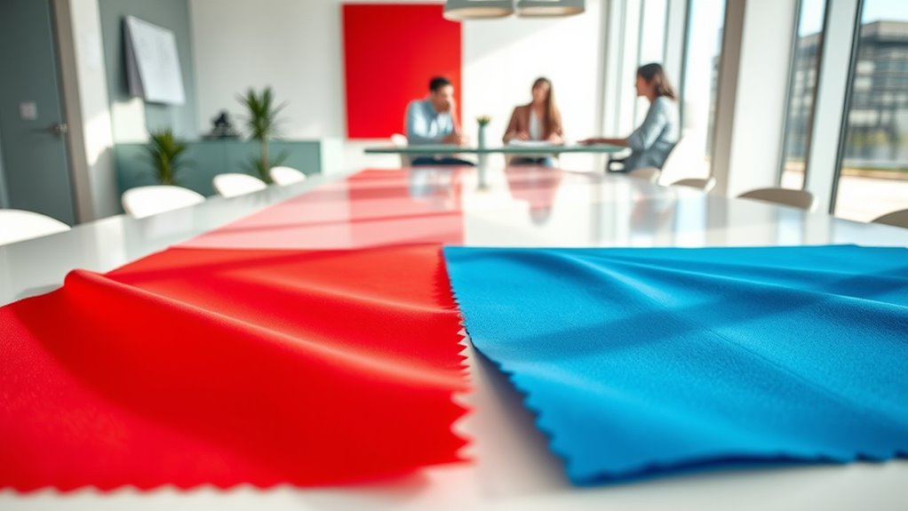
Colors in sports kits do more than just look good; they influence how players and fans perceive the team. This is where color symbolism and color psychology come into play. Certain colors evoke specific emotions and associations—red can symbolize energy and passion, boosting players’ confidence and intimidating opponents. Blue often conveys trust and stability, fostering a sense of calm and cohesion among teammates. Green might represent growth and harmony, encouraging positive teamwork. As you choose colors for your kit, consider these psychological effects—they can impact performance and fan support alike. Understanding color symbolism helps teams strategically select hues that reinforce their identity and influence perceptions on and off the field. Your choice of colors isn’t just aesthetic; it’s a powerful psychological tool.
Cultural Significance of Colors in Kit Design
Understanding the cultural significance of colors in kit design is essential because different societies assign unique meanings to hues that can influence how your team is perceived worldwide. Cultural symbolism shapes how fans and opponents interpret your kit, making regional color meanings vital. For example, red may symbolize luck in China but danger in Western cultures. Green can represent growth in one region and envy in another. Recognizing these nuances helps you design kits that resonate positively or avoid misinterpretation. Additionally, being aware of symbolism in dreams can deepen your understanding of how colors convey complex messages across cultures. Ignoring cultural symbolism risks alienating fans or sending unintended messages. By considering regional color meanings, you guarantee your kit connects authentically with diverse audiences and respects local traditions. This awareness enhances your brand’s global appeal and fosters cultural sensitivity through thoughtful design choices.
How Color Affects Player Performance and Confidence

The right color choice can considerably influence a player’s mindset and performance on the field. Color symbolism plays a key role in how you perceive yourself and your abilities during a game. Bright colors like red can boost confidence and evoke feelings of power, while blue offers a calming effect that helps maintain focus under pressure. The emotional influence of colors can improve your motivation and reduce anxiety, giving you an edge during critical moments. When your kit aligns with the psychological effects of specific colors, it can enhance your overall performance. Choosing the right colors isn’t just about aesthetics; it’s about harnessing their emotional impact to strengthen your mindset, increase confidence, and optimize your game on the field. Additionally, understanding color psychology can help you select hues that support your mental resilience and focus during competition.
Fan Perception and Emotional Connection Through Color
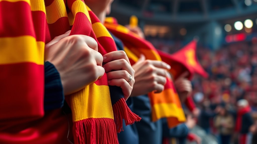
Your kit’s colors don’t just influence your performance—they also shape how fans perceive and connect with your team. Colors evoke emotions that foster fan loyalty and deepen emotional bonds. For example, bold reds can symbolize passion and energy, making fans feel more excited and engaged. Blue often represents trust and stability, encouraging a sense of loyalty. Color symbolism plays a vital role in how fans interpret your team’s identity, creating a visual connection that resonates beyond the game. Fans identify with your colors, which can evoke pride, unity, and a sense of belonging. When your kit reflects the right emotional cues, you strengthen the bond with your supporters, turning casual spectators into passionate fans. In this way, color impacts not just perception but long-term emotional attachment. Additionally, understanding color symbolism can help teams select palettes that align with their desired emotional messaging, enhancing overall fan engagement.
Using Color to Build Brand Identity and Loyalty

Colors are a powerful tool for establishing your team’s brand identity, making it instantly recognizable and memorable. By understanding color symbolism and applying color psychology, you can evoke specific emotions and associations that resonate with fans. For example, red often signifies passion and energy, boosting enthusiasm and loyalty, while blue conveys trust and dependability, fostering long-term commitment. Consistent use of these colors across your kit design reinforces your brand message and builds a strong visual identity. When fans see your team’s colors, they instantly connect with your values and story, strengthening emotional bonds. Strategic color choices make your kit more than just apparel—they become symbols of pride and loyalty that fans wear proudly, ensuring your brand sticks in their minds.
Trends and Innovations in Color Usage in Modern Kit Design
As technology advances and consumer preferences evolve, modern kit design embraces bold, innovative color trends that push traditional boundaries. Designers now experiment with dynamic color palettes, blending vibrant hues with subtle shades to create eye-catching effects. These innovative color choices reflect a desire for visual impact and uniqueness. Additionally, innovative materials enable new ways to incorporate these colors, such as iridescent fabrics or reflective finishes, enhancing visual appeal during movement and under different lighting conditions. This evolution in color usage allows teams to stand out on the field while aligning with contemporary aesthetic trends. By embracing these innovations, kit designs become more than just uniforms—they become bold statements that capture attention and elevate team identity through cutting-edge color application.
Case Studies: Successful Color Strategies in Professional Teams
You can see how team colors reinforce identity and foster unity on the field. These choices also boost brand recognition, making teams instantly recognizable. By understanding psychological responses, teams craft color strategies that inspire confidence and motivate players. Incorporating color psychology principles helps optimize these effects for maximum team cohesion.
Team Identity and Colors
Successful professional teams harness the power of strategic color choices to reinforce their identity and foster team cohesion. Colors play a crucial role in team branding, creating a visual connection that embodies shared values. By understanding color symbolism, teams can select hues that evoke strength, unity, and confidence. Consider these key strategies:
- Align colors with team values to reinforce identity.
- Use bold shades to project confidence and dominance.
- Incorporate consistent color schemes for recognition.
- Leverage colors that resonate emotionally with fans and players alike.
- Recognizing the importance of color psychology in greenhouses can provide insights into creating environments that promote growth and well-being.
These choices strengthen team branding efforts, making colors an essential tool in shaping perceptions. When you select your team’s colors carefully, you create a visual language that communicates your team’s spirit, unifies players, and leaves a lasting impression on supporters.
Brand Recognition Impact
Professional teams that implement strategic color choices often see a significant boost in brand recognition, making their uniforms instantly identifiable on the field. This success hinges on understanding color symbolism, which helps convey team values and identity. For example, bold reds evoke energy and passion, while blues signal trust and stability. Effective color adaptation also plays a role, allowing teams to modify shades for different contexts or fan preferences without losing their core identity. These deliberate choices create a visual consistency that fans recognize immediately, strengthening the team’s brand presence. Incorporating insights from color psychology can further refine these strategies, ensuring that the chosen palette resonates with fans and enhances emotional connection. Case studies of successful teams show how carefully selected colors become a powerful marketing tool, fostering loyalty and making the team stand out in a crowded sports landscape. Your strategic use of color directly enhances brand recognition and team visibility.
Psychological Response Strategies
Building on the impact of color choices on brand recognition, teams can harness psychological response strategies to influence fan perception and behavior. By understanding color symbolism, you can evoke specific emotions and strengthen emotional branding. Consider these approaches:
- Use bold colors like red to energize fans and create a sense of urgency or passion.
- Incorporate calming hues such as blue to foster trust, loyalty, and a sense of stability.
- Combine contrasting colors strategically to enhance visibility and stimulate excitement.
- Align color choices with team values and identity to reinforce emotional connections and brand consistency.
- Paying attention to color temperature adjustments can further optimize the viewing environment and reinforce emotional responses.
Applying these strategies helps shape fan perception, boosts engagement, and fosters a deeper emotional connection with your team’s brand.
Frequently Asked Questions
How Do Color Choices Influence Merchandise Sales and Marketing Strategies?
Your color choices directly impact merchandise sales and marketing strategies by shaping consumer behavior through color association. Bright, energetic colors can attract attention and evoke excitement, boosting impulse purchases. Conversely, calming tones may foster trust and loyalty. By understanding how specific colors influence emotions and perceptions, you can strategically select hues that resonate with your target audience, ultimately enhancing engagement and sales.
What Role Does Color Psychology Play in Youth and Amateur Team Kits?
You recognize that color psychology plays a key role in youth and amateur team kits by shaping team identity and creating an emotional impact. Bright, bold colors foster unity and enthusiasm, boosting team spirit. Cooler shades evoke calmness and focus, while vibrant colors energize players and supporters. Choosing the right colors helps you communicate team values, inspire confidence, and enhance fans’ emotional connection, ultimately strengthening the team’s overall presence and performance.
Can Color Trends Impact Long-Term Team Branding and Identity?
Color trends can markedly influence long-term team branding and identity. If you stay consistent with your colors, it enhances brand recognition and fosters a strong, unified visual identity. While trends might tempt you to change, maintaining color consistency helps your team stand out and build lasting recognition. Adapting to trends carefully ensures your branding remains fresh without sacrificing the core elements that define your team’s identity.
How Do Environmental Factors Affect Color Perception in Kit Design?
Oh, sure, environmental factors like lighting conditions and cultural context totally help you pick the perfect kit colors, right? In reality, they wildly influence how your design is perceived—bright lights can wash out colors, while cultural meanings can turn a sleek design into a controversial statement. You better consider these factors, or your kit might look stunning in the stadium but cause confusion or offense elsewhere.
Are There Ethical Considerations in Using Certain Colors in Sports Kits?
You should consider ethical aspects when choosing colors for sports kits, as color symbolism and cultural significance vary worldwide. Using certain colors might unintentionally offend or alienate groups, so you need to be sensitive to diverse meanings and associations. Respecting these cultural differences helps promote inclusivity and avoids controversy, ensuring your kit design is both respectful and responsible while still appealing to your target audience.
Conclusion
By choosing the right colors, you can boost team spirit, enhance player confidence, and forge stronger fan connections. Did you know that teams with bold, distinctive colors are 35% more recognizable and memorable? So, when designing kits, think beyond aesthetics—consider the psychological and cultural impacts. Your color choices can truly shape perceptions, inspire loyalty, and set your team apart in a competitive sports landscape.